New UI

|
New UI
Can no longer access the site at work, zscalar is blocking it. Just mentioning it cuz the timing is suspiciously coinciding with the new ui
I love the new UI !!!!
Fenrir.Niflheim said: » Can no longer access the site at work, zscalar is blocking it. Just mentioning it cuz the timing is suspiciously coinciding with the new ui I'm at work with zscaler site works fine (old and new UI). I know very little about zscaler so wouldn't surprise me if different companies have different profiles though. Updated:
News entries have a number indicator FFXIclopedia links added Boosted item results in search Posts from blocked users should not show Fixed the youtube embed glitch The new ui has been deployed for a few weeks. I recently just added the link that enables it via cookie. So I'm not sure what would flag zscaler.
[+]


:) yeah don't mind me, I got to enjoy all sites I frequent dropping 1 by 1 all day long as zscalar started to block them. first ah then bg and so on, still can use discord in browser for now...
the "undead" section of the forums doesnt show in latest topics
Hey Scragg, thanks for the updates. Couple things I noticed:
1. Enlarged images on the mobile site can’t be fully viewed (scrolled). For example: https://www.ffxiah.com/forum/topic/59120/september-2026-version-update/2#3797837 2. The chain link icon on a post gives no visual feedback that it’s actually been copied to the clipboard. I kept clicking it thinking it doesn’t work. 3. Forum usernames are cutoff on mobile when logged in, so instead of the full "Server.Name" it’s "Carbuncle.Mie…" etc., for example.  I love the new mobile UI. Maybe I'm dumb, but on mobile I don't see a way to change or confirm which server I'm looking at?
Scragg, the new site layout is stonking good for mobile use. I have a quite small cellphone (480x640) and the new UI is very serviceable. A bit of cutoff here and there, but that's to be expected on a resolution like that. So, don't take that as a complaint, just an observation.
 Lovely :) I prefer the old UI on desktop simply because it's very compact which I like on a big screen. Thank you for keeping it around! AegParm said: » I love the new mobile UI. Maybe I'm dumb, but on mobile I don't see a way to change or confirm which server I'm looking at? Can't find it either.
[+]

What was the motivation behind focusing on mobile formatting? Everyone is already on PC playing and would seem to me much more likely to tab to a browser rather than pick up a phone.
Thanks for keeping the old look. Hard to adjust to all the empty space in the new layout. kaffy said: » Everyone is already on PC playing and would seem to me much more likely to tab to a browser rather than pick up a phone. If nothing else, it's good if you need to look something up on the go, lol kaffy said: » Everyone is already on PC playing and would seem to me much more likely to tab to a browser rather than pick up a phone. I think there's a decent enough amount of people playing on Steam Deck and the like, or streaming to a TV. Or just not at home.. so its a welcome addition
For what it's worth, on my phone, the way forum posts are in the new version makes the user's name the least prioritized piece of the poster information so I can't even see Shadowlina's name on the post because it gets hidden by the title/icons/etc.
 Things like a title and various links should probably go on a new line under the name in my opinion.
[+]
Love the work on the new design. I might not be aware of it, but in the classic layout there's one button I can click to take me to my character's page from the main page, is there something like this on the new design? Right now I click my profile, click characters, then clicking on the character- really miss the simple one click method of getting there.
My only other large gripe atm is the sold to/bought from layout of the sales history makes it a little more cumbersome to view incoming/outgoing gil than the original layout. Ragnarok.Reze said: » Love the work on the new design. I might not be aware of it, but in the classic layout there's one button I can click to take me to my character's page from the main page, is there something like this on the new design? Right now I click my profile, click characters, then clicking on the character- really miss the simple one click method of getting there. My only other large gripe atm is the sold to/bought from layout of the sales history makes it a little more cumbersome to view incoming/outgoing gil than the original layout. i agree. the new layout is kinda slick looking, but these are my same gripes as well Where is the UI toggle supposed to be?
King123 said: » Where is the UI toggle supposed to be? On the old layout, it's in the sidebar. You have to scroll all the way up to see it. 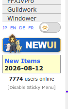 In the mobile layout, it's in the top right. 
[+]
Honestly, thank you for your hard work to continue updating this website. It's nice to come back to the game after so long and still have this companion site!
[+]
I appreciate all the work you guys put into keeping the site updated. I don't have too much to add to the discussion, but there is one thing that sticks out to me. The some of the icons for the items have borders they never used to. It almost looks like half of these are intended for dark mode and half are light mode. Maybe you're working on updating all of them and only some have been changed, or maybe something is off. I don't know. I just know it didn't look that way before.

[+]
I think it's a simple CSS rendering/background conflict with the new code and the small images used as icon for those types of list.
Should be a simple fix Tried the new ui on pc noticed my "equipped gear" was from weeks ago and did not match my current gear like the normal page.
Quote: Love the new UI! very simple and finally got a dark mode!! YouTube Video Placeholder
[+]
Scragg, most of the new ui looks great but the rewards pages are pretty much unusable in the new ui:
https://www.ffxiah.com/rewards/ambuscade They changed from being a table to a list, and also seem to be ramming only a subset of the table row data into the list. example Gil/Gallantry exists but Gil/Hallmark does not old:  new:  Another thing I noticed in the new UI (it's much better now and I'd say possibly better for mobile?) is that quoting is kind of borked.
If I highlight part of a post by someone, then click the quote button on the old site, it quotes the part I highlighted. If I do the same thing on the new UI, it quotes the entire post and not the part I highlighted. I do this a lot and going back to delete the irrelevant parts of their post, especially if there are many layered html elements, is super annoying. If this could be fixed to work the way it does in the old UI, it would be significantly more user-friendly IMO. Magified said: » Scragg, most of the new ui looks great but the rewards pages are pretty much unusable in the new ui: https://www.ffxiah.com/rewards/ambuscade They changed from being a table to a list, and also seem to be ramming only a subset of the table row data into the list. example Gil/Gallantry exists but Gil/Hallmark does not Rewards page has been reworked for larger screens Maletaru said: » If I highlight part of a post by someone, then click the quote button on the old site, it quotes the part I highlighted. This should be fixed
[+]

Jinxs said: » Tried the new ui on pc noticed my "equipped gear" was from weeks ago and did not match my current gear like the normal page.
[+]
|






























All FFXIV and FFXI content and images © 2002-2026 SQUARE ENIX CO., LTD.
FINAL FANTASY is a registered trademark of Square Enix Co., Ltd.